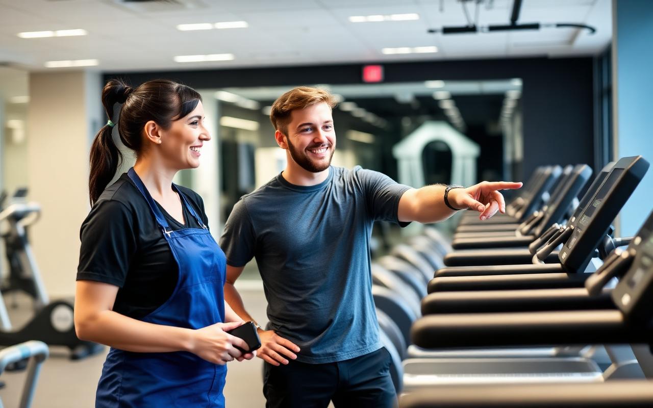
What is a gym trial landing page?
A landing page is the page a visitor enters through. A dedicated campaign landing page is specifically designed around one audience, offer and next step.
For a gym, that could be:
- A guided tour
- A paid day pass
- A free trial with clear eligibility
- A beginner induction
- A small-group introductory session
- A consultation before a coaching programme
A dedicated page is not automatically better than every service page. It is useful when a campaign has a narrower promise than the homepage.
Choose the offer before designing the page
Different offers solve different concerns.
| Offer | Useful when | Information to make clear |
|---|---|---|
| Guided tour | Prospects want to see the facility | Duration, appointment process and no training requirement |
| Day pass | Prospects want to experience normal training | Price, access, eligibility and included facilities |
| Trial session | Prospects need to try the service | Format, coach, ability level and conditions |
| Beginner induction | Prospects want reassurance | Guidance, equipment introduction and next steps |
| Coaching consultation | Needs require discussion | Purpose, duration and whether training is included |
Do not describe a paid day pass as a free trial. Do not hide a required membership commitment in small print.
Who is the campaign for?
Define the audience clearly enough to make the page useful. “Everybody who wants fitness” provides little direction.
Examples:
- Local adults nervous about starting
- Experienced lifters comparing equipment
- Busy people considering coached group sessions
- Returning exercisers who want a manageable restart
The page can remain welcoming while communicating the offer’s actual fit. Avoid claiming suitability for medical conditions or rehabilitation without appropriate qualified input.
For broader promotion, read gym marketing ideas.
A practical gym landing-page structure
1. A clear first screen
Show the offer, location and main benefit. The visitor should recognise the campaign they clicked.
A fictional example:
“Try a coached beginner session in [town]. Meet the team, explore the gym and find out how your first month could work.”
Add one primary button such as “Request My Trial”. If the booking is not instantly confirmed, do not label it “Confirm My Appointment”.
2. A direct explanation of the visit
Explain what happens, how long it takes where known, what to bring and who greets the visitor. This reduces uncertainty without requiring a phone call.
3. Who the offer suits
Give a plain-language suitability description. Say whether beginners are welcome and whether there are relevant age or participation restrictions.
4. Real facility and coaching proof
Show the actual gym and people. Include genuine reviews where available and authorised. Never fabricate a transformation or claim universal outcomes.
5. The offer and terms
Make the cost, inclusions, eligibility, expiry and any commitment visible close to the action.
6. A short form or supported booking tool
Collect what is needed to arrange the visit, not everything the gym might eventually require.
7. Practical location details
Include the address, parking and how to identify the entrance. A map can be useful, but do not load a heavy interactive embed unnecessarily.
8. FAQs and a final CTA
Answer the remaining first-visit objections and repeat the same primary action.
Offer & location
Headline, benefit, one primary button
Real proof
Your gym, your team, authorised reviews
Terms
Cost, inclusions, eligibility, expiry
Short form
Name, contact, preferred time
Location
Address, parking, entrance
Write the headline around the offer
Weak headings leave the visitor to guess. Stronger ones describe the real next step.
| Vague | More specific fictional alternative |
|---|---|
| Transform your life today | Book a guided tour of our strength gym in [town] |
| Unlock your potential | Try a beginner coaching session with our local team |
| Start your journey | Buy a day pass and explore the training facilities |
Use the actual gym voice. Specific does not mean exaggerated.
Avoid “only three spaces left” unless availability is real and maintained. Do not invent deadlines to create pressure.
Make the form easy and honest
A sensible first-visit request might collect:
- Name
- Preferred contact details
- Preferred time or availability
- A short optional question
- Necessary consent information
Explain whether staff will call or email. Marketing permission should not be silently bundled with an appointment enquiry.
Where health screening is necessary, handle it through the correct secure process and only collect what is needed. Do not send screening information to analytics or store it in an unprotected general-purpose table.
For website-wide friction, see why gym websites fail to generate enquiries.
Planning a trial campaign?
We can build a focused page that matches your offer and works with your existing booking tools.
Use the right booking technology
A gym already using membership software may have a supported booking or pass-purchase flow. Check what it offers before building a separate booking system.
Compare gym management software, and if relevant review Ashbourne website integration.
The public page should still explain the offer before handing over to another platform. Verify that the destination supports the exact offer and that the price is consistent.
Design the confirmation experience
Submitting a form should lead to useful confirmation, not a blank page.
For a request awaiting approval, a fictional message could be:
“Thanks. Your trial request has been received. The gym team will contact you using the details provided to arrange a suitable time. Your appointment is not confirmed yet.”
For a confirmed booking, show the actual approved appointment details.
Add practical guidance such as arrival location and what to bring. Do not display sensitive information in a URL or expose booking details publicly.
Trial request received
Status: awaiting confirmation
When you arrive
What to bring
Should a landing page have navigation?
A campaign page can use a simpler header to reduce distraction while retaining branding, contact information and trust.
Organic resource pages should normally retain the site’s standard navigation. Do not remove navigation from Gee Web Design’s educational guide simply because the article describes campaign landing pages.
Footer privacy and legal links should remain accessible on any campaign implementation.
Should gym trial pages be indexed?
It depends on their purpose.
An evergreen, substantial introductory-service page may be suitable for indexing. A near-duplicate test variant, temporary advert-only page or confirmation page often needs a different indexing decision.
Noindex is not a security control. Sensitive appointment information should never rely on noindex for protection.
This guide is an educational resource, not a live trial offer from Gee Web Design.
For overall search planning, see SEO for gyms. Avoid creating multiple thin pages for the same offer purely to target town variations.
Track the full journey
Define events accurately:
- Campaign visit
- Primary button click
- Successful request or booking
- Appointment confirmed where relevant
- Visit attended
- Membership started
- Continued membership
A successful form submission can be tracked as a lead. A click alone should not be counted as one.
Where confirmed attendance happens in a CRM or membership system, use a permitted reporting process. Do not infer attendance from a thank-you-page view.
| Metric | Calculation | Why it matters |
|---|---|---|
| Request conversion | Successful requests ÷ relevant sessions | Indicates page-level action |
| Attendance rate | Attended visits ÷ booked visits | Shows whether bookings become experiences |
| Trial-to-member conversion | New memberships ÷ attended trials | Shows sales outcome |
| Cost per attended visit | Relevant campaign cost ÷ attended visits | Connects spend to actual visits |
| Cost per member | Relevant campaign cost ÷ attributed members | Supports commercial evaluation |
Use consistent attribution, time periods and definitions. Avoid comparing unrelated audiences as if they were identical.
Follow up without pressure
Assign an owner to each request. Provide useful reminders and a rescheduling option. After the visit, explain the appropriate membership choices and answer genuine questions.
Respect communication preferences. Do not turn a trial request into permission for unlimited marketing messages.
Our how to get more gym members guide connects these steps with onboarding and retention.
Test improvements carefully
Useful tests may compare:
- Tour versus trial offers
- Headline wording
- Placement of proof
- Form length
- Booking request versus supported instant booking
- Facility photographs
Change one meaningful variable at a time where practical. Plan the success metric and avoid declaring a winner from a tiny sample. A change that generates more unqualified requests may be commercially worse.
Landing-page launch checklist
- Offer matches the campaign
- Prices and terms are visible
- Real photographs have permission
- Form and notifications work end to end
- Appointment status is clear
- Mobile layout and keyboard use are tested
- Provider links reach the intended destination
- Tracking events are not duplicated
- Privacy and consent behaviour are reviewed
- Follow-up ownership is agreed
- Page indexing decision matches its purpose
- Staff can honour the offer
Before launch, check the core gym website features, plan any gym website redesign carefully, and make sure local searchers can find you: see why your gym is not showing on Google and our Google Business Profile guide for gyms.
Need a focused page for your gym campaign?
Gee Web Design creates websites and landing-page journeys for UK fitness businesses. Scope depends on copy, design, existing systems and required functionality.
This is website support, not a claim that every project includes advertising management. Third-party software, campaign spend and ongoing SEO are separate unless specifically agreed.
Explore gym website design, review gym website costs and website packages, or discuss a gym landing page.
A clear next step for every campaign visitor
Tell us about your offer and booking tools, and we’ll suggest a sensible scope.
Frequently asked questions
Is a landing page better than the gym homepage?
For a specific campaign, it can create a clearer match between the advert and offer. A homepage still plays an important role in broader discovery and comparison.
Should I offer a free trial or a paid day pass?
Choose based on audience, staffing, capacity and economics. Measure attended visits and memberships rather than choosing the offer with the most form fills.
How long should a trial landing page be?
Long enough to answer the visitor’s decision questions. There is no universal ideal word count. Keep useful detail and remove repetition.
Do I need separate pages for every advert?
Not always. Use a separate page when the audience or offer meaningfully differs. Avoid unnecessary near-duplicate pages.
Does a thank-you-page visit prove a booking?
No. Use the actual successful submission or confirmed booking event, then reconcile with operational records.
Can a landing page guarantee more members?
No. Traffic quality, offer, availability, follow-up and the first-visit experience all affect results.
Related gym guides
How to Get More Gym Members
Connect trial offers with follow-up, onboarding and retention.
Gym Website Not Generating Enquiries?
Find the website-wide friction that stops visitors acting.
Gym Marketing Ideas
Practical ways to promote an introductory offer locally.
Ashbourne Gym Website Integration
Hand prospects over cleanly to a supported joining journey.
Author and references
Written by Gee Web Design. Last reviewed: 1 October 2026.
For website foundations, see Google’s SEO Starter Guide. Booking integrations must follow the chosen provider’s current official documentation. The campaign recommendations above are editorial guidance, not guaranteed benchmarks.